
Turning a bookstore website into an invitation to visit in person.
Paper Boat Booksellers
The background
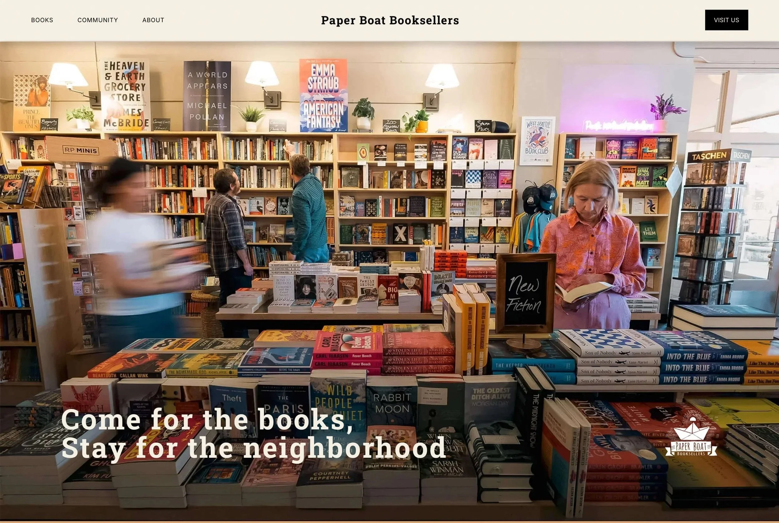
Paper Boat Booksellers is an independent bookstore located in the heart of West Seattle’s shopping district. An anchor point in the community, their store is warm, inviting, and thoughtfully curated, with staff recommendations, local favorites, events, book clubs, and the kind of atmosphere that makes you want to stay and browse.
They asked us to redesign their bookstore website, as their old website felt disconnected from the in-store experience and the community they are striving to create. While it provided information, it didn’t convey why Paper Boat was worth visiting, or entice people into the store.
As we started our research, we wondered why people continue to choose independent bookstores when Amazon has the competitive advantage over price, inventory, and convenience. The answer was surprisingly simple: independent bookstores offer discovery, conversation, community, and an in-person experience.
This was the discovery that helped focus and shape our goal. Create a website that would make someone who had never heard of Paper Boat want to visit the store in person.
The strategy
It is easy to assume that a bookstore is selling books, and therefore the job of its website is to make those books easier to buy. (Cue the monotonous parade of indistinguishable bookstore websites.) But that misses the reason why people choose to visit a place like Paper Boat, where a visit might mean finding a book you weren’t looking for, reading a staff recommendation, talking with a bookseller, or coming to an event. And in Paper Boat’s case, the experience extends beyond the store.
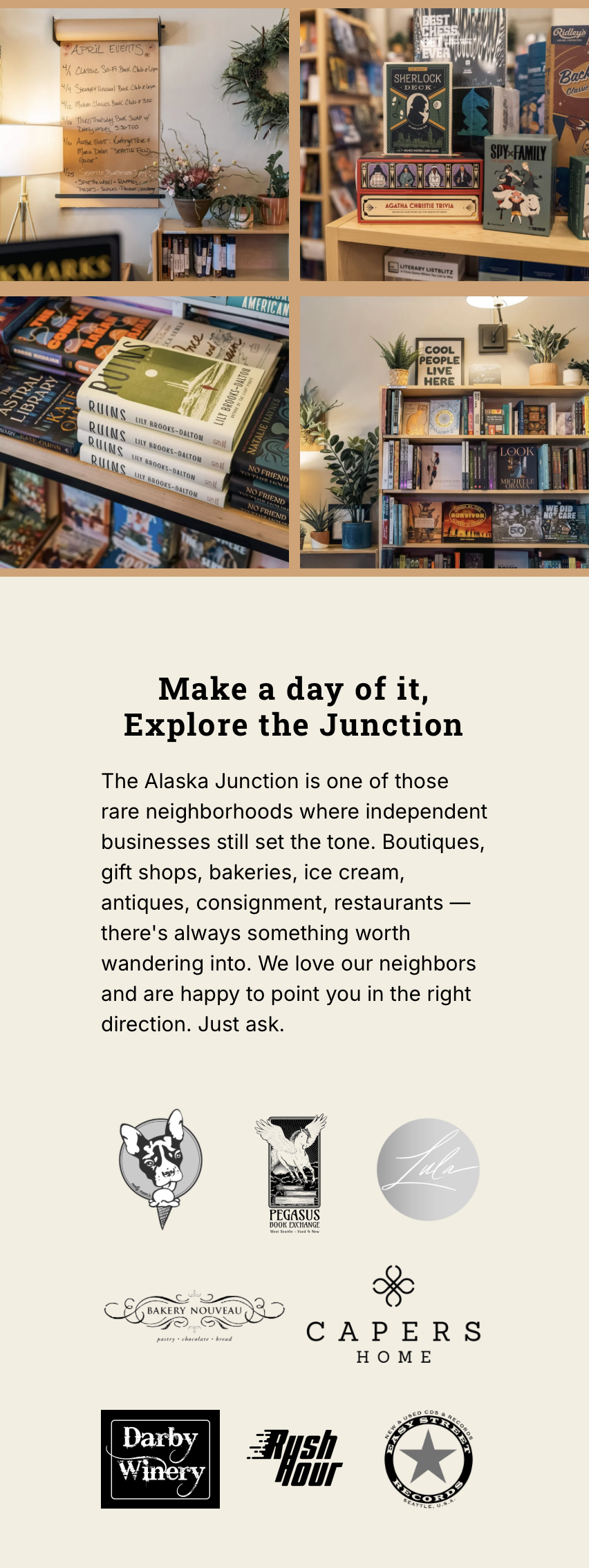
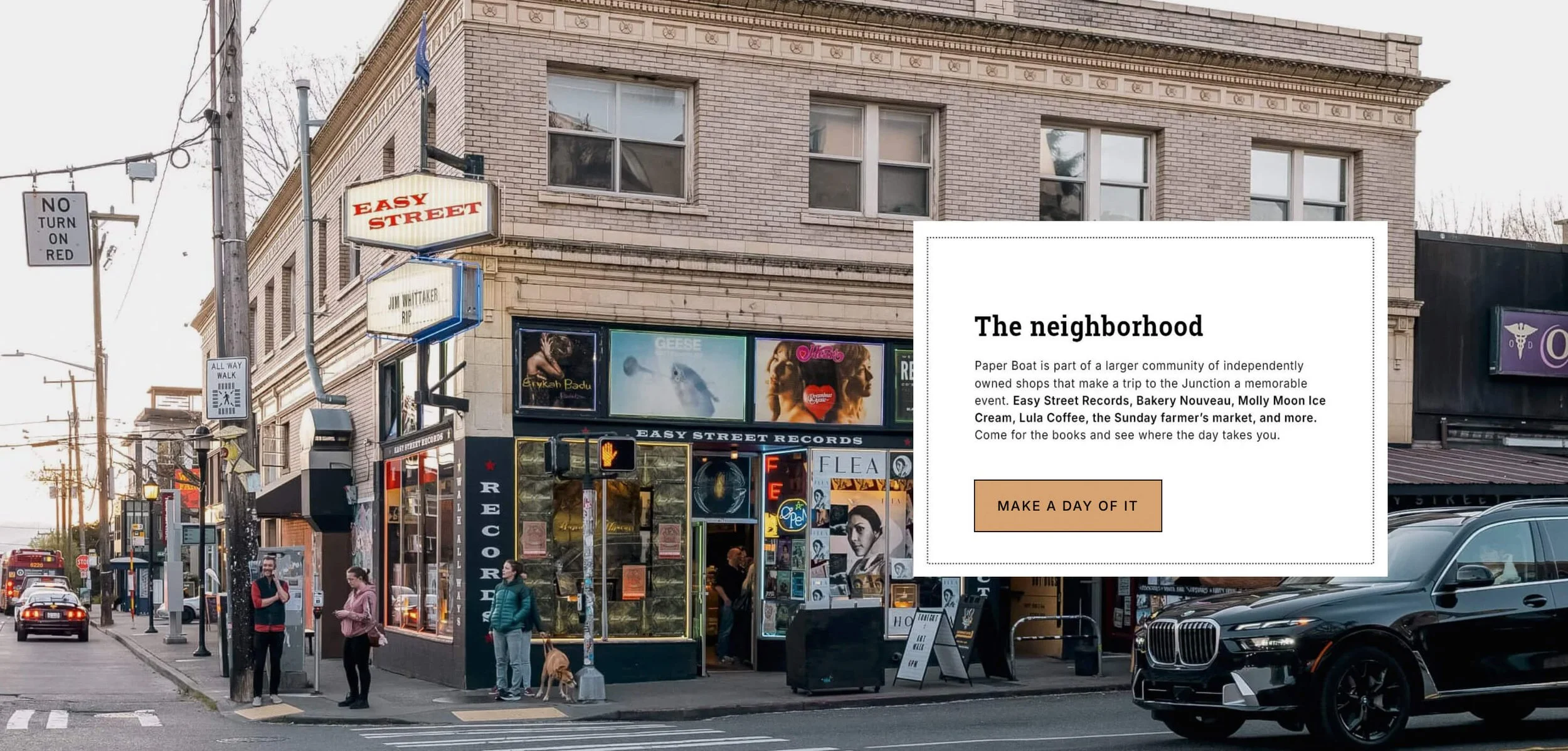
The West Seattle Junction is full of independently-owned restaurants, bakeries, cafés, boutiques, a record store, a Sunday farmers market, antique shops, and more.
That led us to think beyond the walls of the bookstore. Instead of treating the surrounding businesses as competition, we made them part of the reason to visit. Come for a book, get lunch, browse the record store, find a sweet treat, and make a day of it.
The website was built around that idea, with more emphasis on experience, community, events, people, discovery, and planning a visit, while still making practical things like hours, parking, gift cards, and online ordering easy to find.
The results
We chose to monitor metrics that measured intent to visit the store: Events and Visit Us page views, as well as engagement and bounce rate. In the second full month after launch, compared with the same 30-day period the previous year, the results are as follows:
| Old site | New site | Change | |
|---|---|---|---|
| Events page views | 120 | 368 | 207% |
| Visit Us page views | 126 | 187 | 48% |
| Visit Us page engagement | 0:52 | 1:17 | 48% |
| Unique visitors | 2.2K | 2.8K | 27% |
| Overall bounce rate | 72.65% | 57.69% | 15-point improvement |
The part that matters most is not simply more people visiting the website, but rather where their attention went. More people have explored events. More people reached the Visit us page, and they spent more time there too.
We can’t say how many of those people ultimately walked through the front door as we weren’t measuring physical foot traffic. But we can see that people are engaging more with the parts of the site most closely connected to the strategy: discovering what is happening at Paper Boat, learning more about the store, and considering a visit in person.